
Imagine a red triangle. What did you see?
Probability is you have visualized a red equilateral triangle. But I haven’t specified the type and shade of red. Then how did it happen? We have inbuilt perceptions about colors.
There is an association between colors and emotions. Colors have an impact on how we feel about certain things like the peaceful vibe of greenery, the calming effect of sunset, the passionate feel of red. Colors have so much meaning and can form an emotional connection. As a designer, you should learn to choose colors wisely. As colors can blend together, enhance each other, and oppose each other.
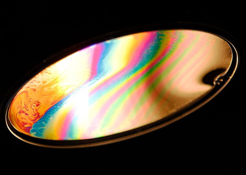
Image source: flickr
” Research reveals people make a subconscious judgment about an environment or product within 90 seconds of initial viewing. Between 62% and 90% of that assessment is based on color alone.”
What is the Color Wheel?
The color wheel is the basis of color theory. It shows the relationship between primary colors, secondary colors, and tertiary colors. By mixing two primary colors, you get the secondary colors. Mixing primary colors with secondary colors give you tertiary colors. Use slidevilla to create a color balanced designs.
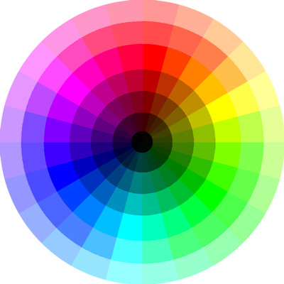
The color wheel was developed in 1666 by Sir Issac Newton. He took some prisms and mirrors and observed the whole spectrum of colors. He was the first to devise a circular diagram of colors.
There are two types of color wheel: the RGB (Red, Blue, and Green) color wheel and the RYB (Red, Yellow, and Blue) color wheel.
Primary, Secondary and Tertiary colors
A color wheel is a mix of primary, secondary, and tertiary colors.
- The primary colors include red, blue, and green in the RBG color wheel and red, yellow and blue in the RYB color wheel. These colors together create white light. It’s not possible to find a primary color missing in any color ever made.

image source: Slidevilla
2. Secondary colors
A secondary color is a mixture of two primary colors. In RGB, the color wheel, the secondary colors are cyan, magenta, and yellow. In the RYB color wheel, the colors are purple, orange, and green.
3. Tertiary colors
When a primary color and a secondary color is mixed, it results in tertiary color. A total of six tertiary colors are there in the color wheel.
- Color combinations
The colors that are placed opposite to each other in the color wheel are complementary. The high contrast of these colors creates a vibrant look. These colors are not suitable to be used for texts.
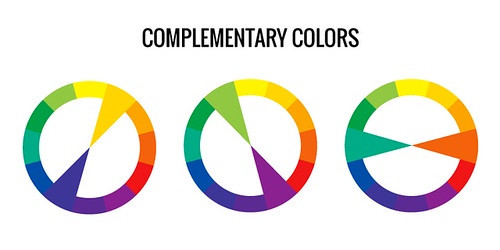
Image source: CC Search
- Analogous colors
The colors that are placed next to each other in a color wheel are analogous colors. They are used to create comfortable and serene design. You can witness this color scheme in nature. The balance is created by choosing one dominant color, one supporting color, and one color to be used as an accent.
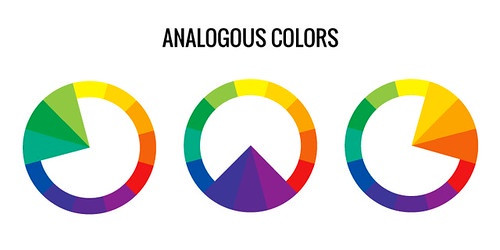
Image source: CC Search
- Monochromatic colors
The colors that have the same hue with different level saturation. They have low contrast and typically match. The direction should be from light to dark.
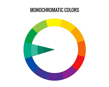
Image source: CC Search
- Triadic color
This color scheme uses colors that are spaced evenly on a color wheel. They create a vibrant and harmonious look. Use one dominant color and the other two as accents.
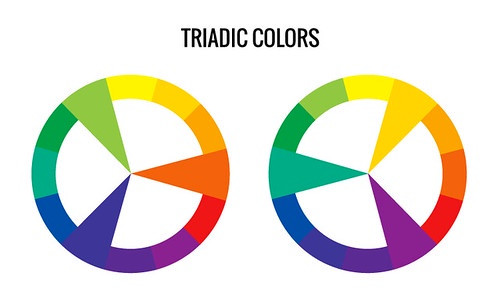
Image source: CC Search
- Tetradic colors
This color scheme uses four colors arranged into two complementary colors. It offers variations. It works best when you choose one color as dominant.
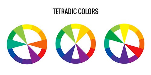
Image source: CC Search
- Hue, Saturation, and Brightness
Hue refers to colors that have no addend shade. A Hue is the dominant color family of a specific color. White, Black, and Grey can never refer to as hue.
Saturation is the intensity of a hue from a gray tone to pure colors.
Brightness is the amount of lightness or darkness of a color, from black to white.
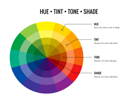
Image source: flickr
- Shades, Tints, and Tones
Tint means adding white to hue to make it lighter. It is lighter than the original hue color. It tends to be soft and less defined.
Shade means adding black to hue to make it darker. The shade is darker and less colorful than the original hue.
Tones mean adding Gray to hue to lower the intensity. Too much Gray makes hue dull.
- Warm and cool colors
The color division takes place following the placement of colors on the color wheel. The colors on the right side of the wheel are warm colors. These include colors red, yellow, and orange. The warm colors are more vibrant.
These colors are named warm because of the feelings it creates. It creates a sense of warmth and comfort.
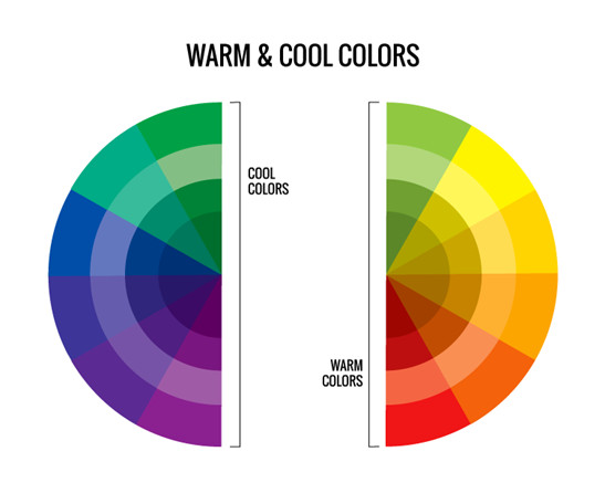
Image source: flickr
The colors on the left-hand side of the color wheel are cool colors. The colors it includes are green, blue, and violet. Cool colors are named cool because of their cool hues. They tend to convey a refreshing feel.
Mixing warm with cool colors will result in a balance and contrast between different hues.
Conclusion
Colors are used for attracting attention, convey meaning, and induce feelings. A perfect combination of colors can leave a lasting impact on the mind. So it’s vital to understand the color theory.
“Everything that you can see in the world around you presents itself to your eyes only as an arrangement of patches of different colors.”
-John Ruskin
Color is not only art but also science. The color combination of your food can increase your appetite. Red and yellow colors are used in cartoons and animation to enhance the image. Colors may seem pretty simple but, explains the seasons well.
Think about the impact and mood you want to set through your design and then choose the colors wisely.
