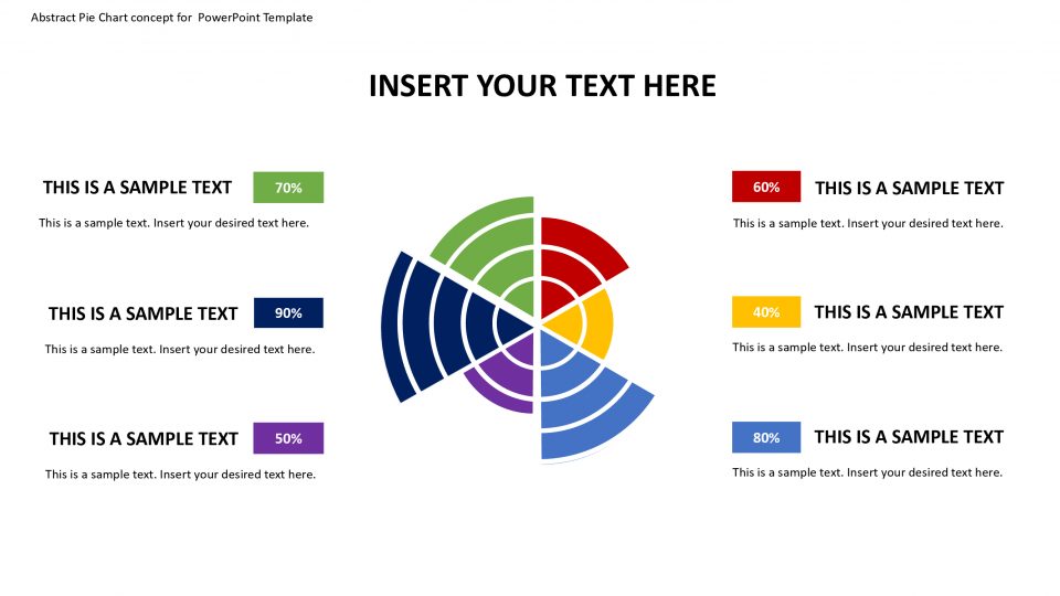
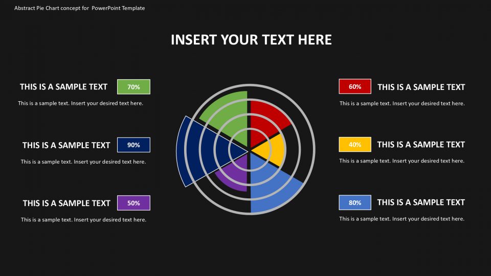
This expert introductions contains a lot of various Microsoft PowerPoint Data Driven Radar Charts adjusted to picture information in another organization called Polar Charts. The Charts are made with the Excel and PowerPoint worked in usefulness and with the assistance of implicit version properties, controlled to create distinctive visual portrayals. This PowerPoint Template gives the client the capacity to alter the graphs simply changing the information, without the need of any shape version. Complex diagrams are made with expert information control, making Polar Area Charts and Polar Pie Chart, which are renditions of the Radar Chart that don’t come as implicit alternatives. The client will almost certainly effectively make Polar Area Charts simply refreshing a section in an exceed expectations spreadsheet, the equivalent happens for the Polar Pie Chart.
The Polar Area Chart is like a normal pie graph, with the exception of segments are equivalent points and vary rather in how far every part stretches out from the focal point of the circle. This visual portrayal is well known to plot cyclic occasions (number of offers by months). For instance in the deals by month, the territory will be isolated in a year while each dimension speaks to the tallies of offers.
Features:
- Completely editable in terms of shape, color, size and text
- This template has a built in color theme which is unaffected by copy-pasting
- Includes an icon family with 135 unique completely editable icons
- Drag and drop image placeholder
- Completely editable (using spreadsheet) data-driven charts for displaying statistics
- Completely editable vector graphics
Supports
Microsoft PowerPoint 2010, 2011, 2013, 2016
MacOffice 2016, MacOffice 365


Be the first to review “Abstract Pie Chart concept for PowerPoint Template”