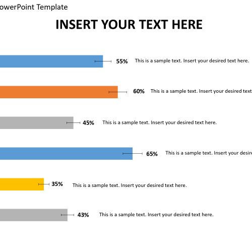
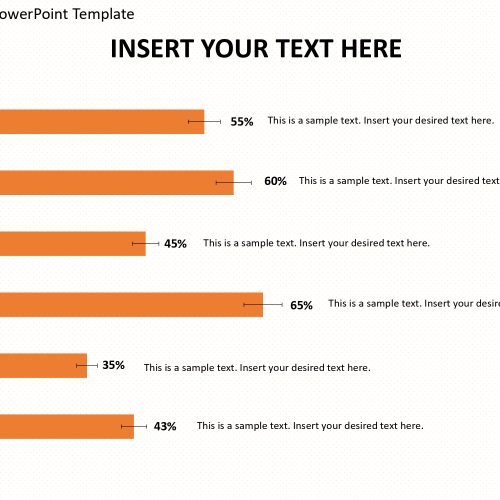
The bar chart error report PowerPoint template is used to explain business presentations, and trends. It is used for explaining complex data, and representing the data with accurate percentile that will aid easy understanding. This template is best used in organizations that have departments or units, to show how well each department is fairing and/or their contribution to the growth of the organization. It can also be used to explain a business strategy and processes involved and how complete each stage is in percentile.
It is used as a singular report presentation. The horizontal bars are editable, and the colors of the bars can be edited to taste and texts can be put in the text bars, the percentage represented by each bar is dependent on the length of the bar. That is if it wants to show the strength of departments in an organization, the longer the bar, the higher the percentage, the shorter the bar, the lesser the percentage. It has text bars beside each bar and a column for years on the x-axis. It is easy to use and understand, and can be modified without altering the image resolution.
Features:
- Completely editable in terms of shape, color, size and text
- This template has a built in color theme which is unaffected by copy-pasting
- Includes an icon family with 135 unique completely editable icons
- Drag and drop image placeholder
- Completely editable (using spreadsheet) data-driven charts for displaying statistics
- Completely editable vector graphics
Supports
Microsoft PowerPoint 2010, 2011, 2013, 2016
MacOffice 2016, MacOffice 365


Be the first to review “Bar Chart Error Report for PowerPoint Template”