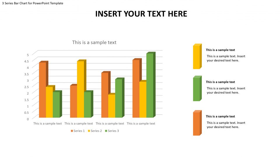
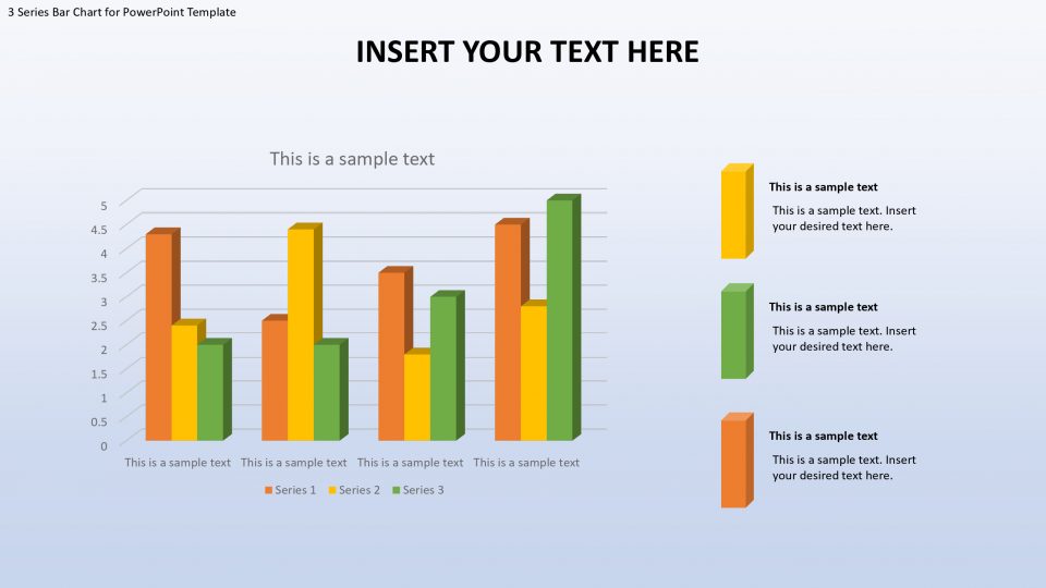
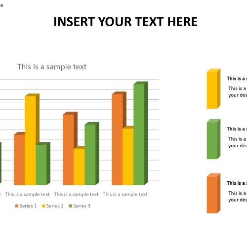
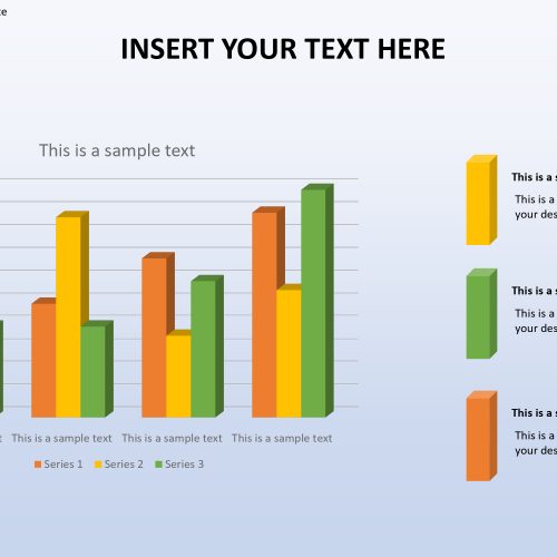
The bar chart clustered category PowerPoint template is an array of vertical bars that are grouped together in a cluster. The bars are color based and each color means something. At the far right of the template three icons of different colors (yellow, blue, green), are used to indicate what each color stands for, so the bars with the same colors show level of the information as depicted in the x and y axis.
The PowerPoint layout is ideal for information driven introductions, for example, showcasing and deals. It is nonexclusive which implies that any topic can be connected. It very well may be utilized in research introductions where the client can imagine grouped outcomes. It is perfect for insights and stock. Numerous business ideas can discover it very valuable, for example, money related announcing and in gauging techniques.
A clustered bar diagram comprises of numerous gatherings of information masterminded graphically. The information is quantitative and the stature of the bars is commonly relative to these qualities. The outline can stress of various homogeneous bunches in a heterogeneous setting. Along these lines, examination turns into significantly simpler. Examples can develop on the diagram and holes can be effectively recognized.
Features:
- Completely editable in terms of shape, color, size and text
- This template has a built in color theme which is unaffected by copy-pasting
- Includes an icon family with 135 unique completely editable icons
- Drag and drop image placeholder
- Completely editable (using spreadsheet) data-driven charts for displaying statistics
- Completely editable vector graphics
Supports
Microsoft PowerPoint 2010, 2011, 2013, 2016
MacOffice 2016, MacOffice 365


Be the first to review “3 Series Bar Chart for PowerPoint Template”